Drift Drill Down
The Drill Down tab shows how the data a deployed model scores in production drifts, feature by feature and over time, away from the data it was trained on. It reached DataRobot’s cloud users as a public preview in October 2022.
Drift is measured as the Population Stability Index and drawn as a heat map: one row per feature, one column per time bucket, each cell healthy, at risk or failing against a threshold. A bar chart beneath shows the prediction sample size behind each bucket, so a red cell backed by a handful of predictions reads differently from one backed by thousands. Dragging across the heat map sets the comparison period.

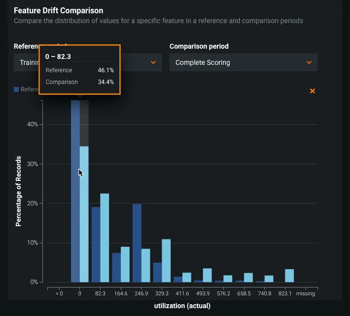
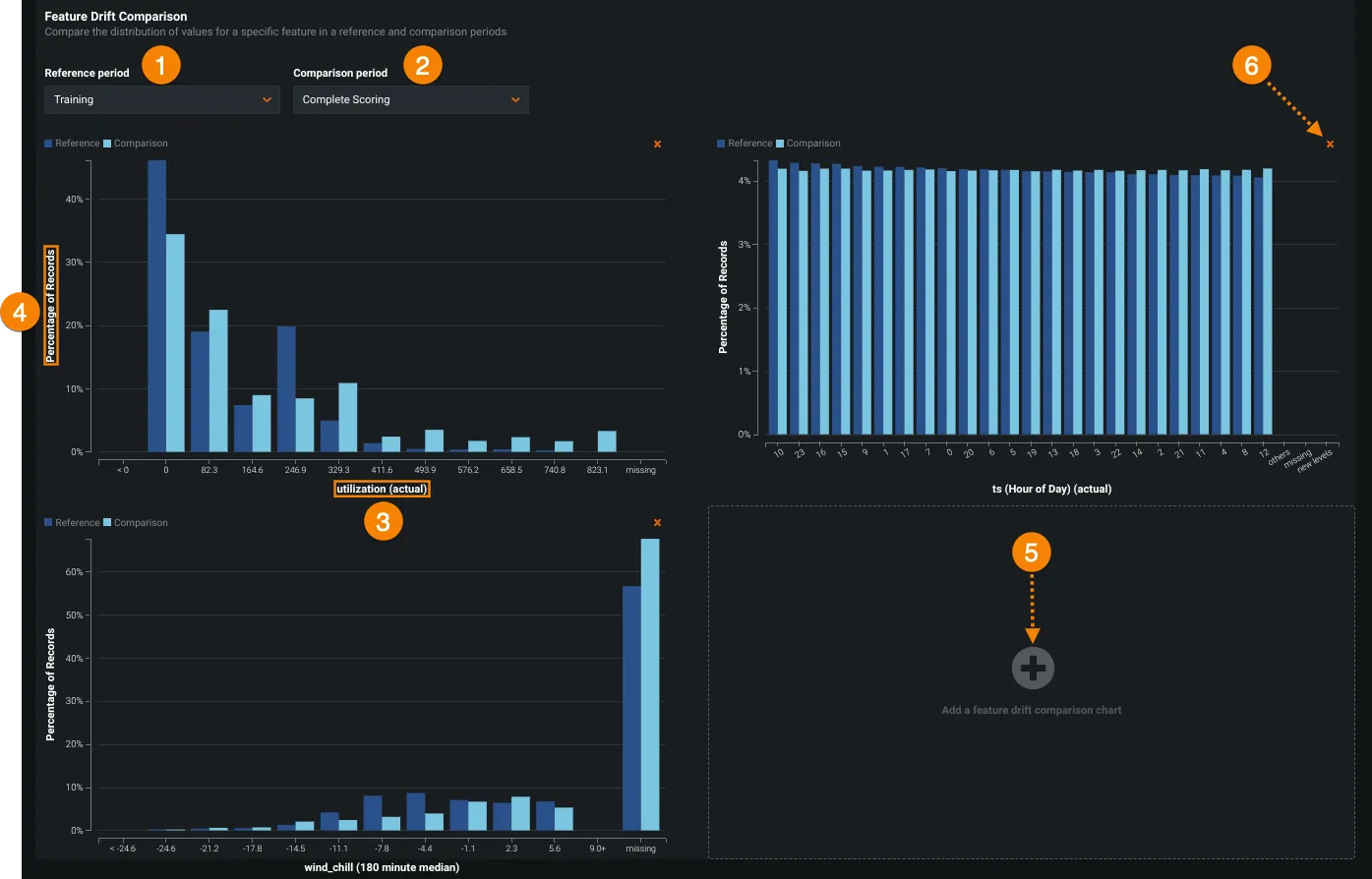
Selecting one or more features opens a Feature Drift Comparison chart for each, setting its distribution in a reference period against a comparison period. That is where the cause shows up: a data quality issue, a change in feature composition, or a change in the context of the target variable.
Hovering a bucket gives the exact share of records in each period, so a gap between two bars can be checked against a number before anyone retrains on it.