Flight Sense
Flight Sense was Leapcraft’s analytics service for corporate travel: it read a company’s raw flight bookings and turned them into a dashboard of where its people fly, on which airlines, and how often.
Booking data came in through middleware that read the legacy formats and protocols of travel management companies and GDS backbones, joined with metadata from other sources. It could run in the cloud or on premise.
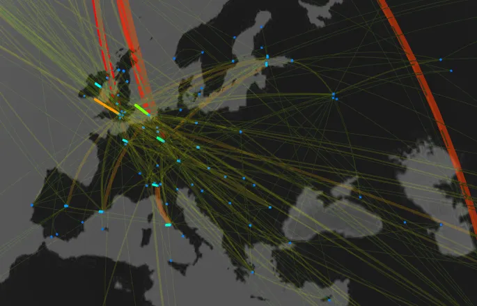
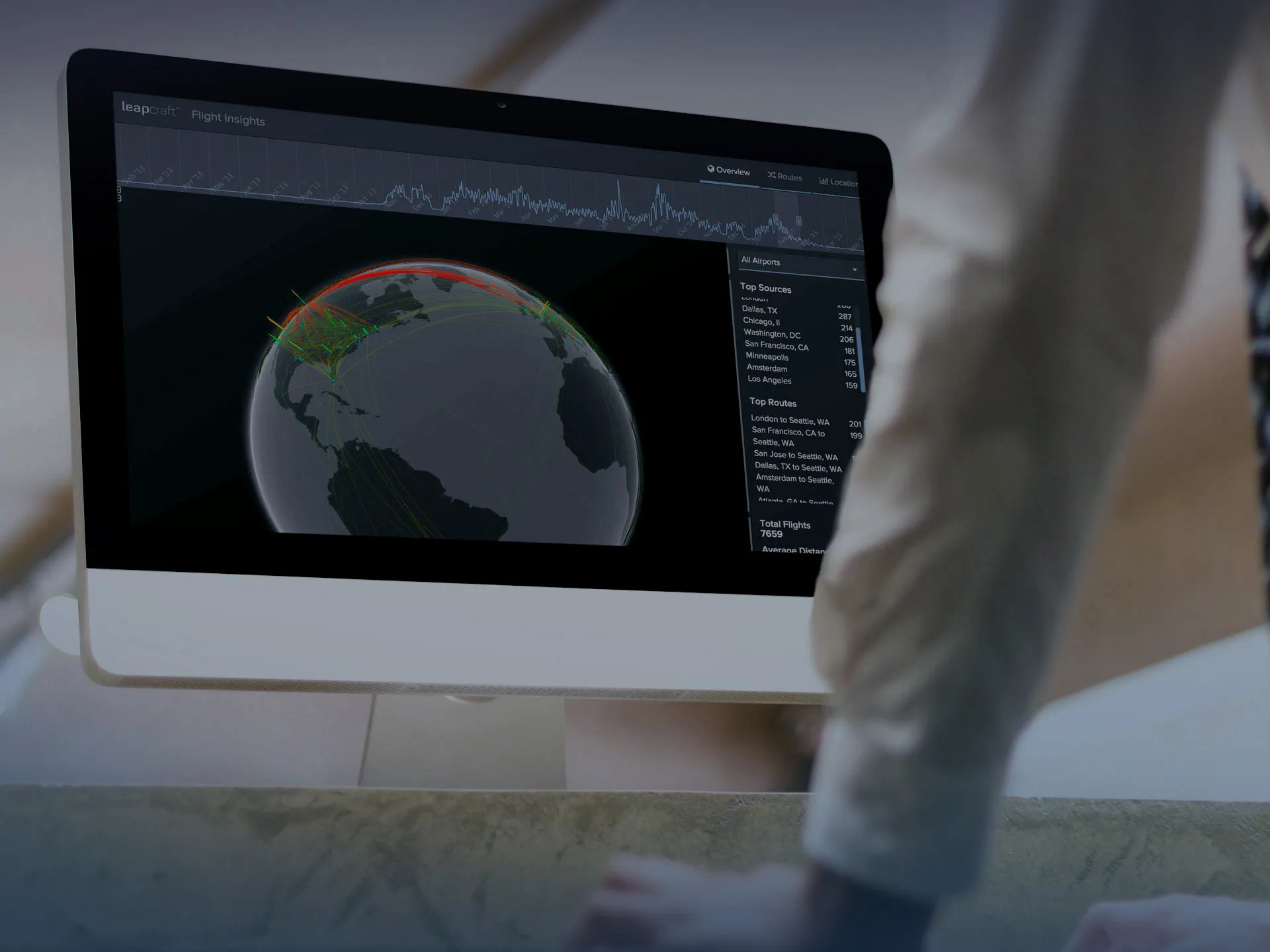
Routes are drawn as arcs on a globe, colored by traffic volume.
The Overview tab pairs the globe with a timeline of booking volume and ranked lists of top source airports and routes.
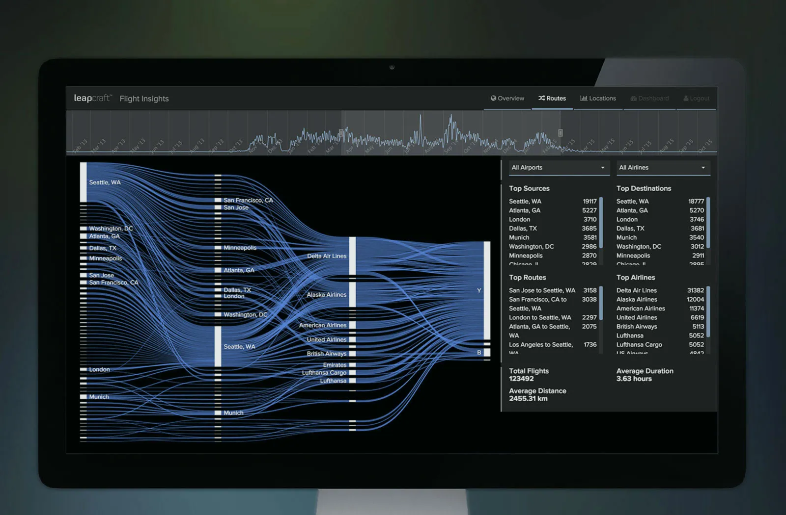
The Routes tab lays the same bookings out as a Sankey diagram, source airport to destination to airline, so an airline’s share of a city pair reads off the width of its band. Totals for flights, average duration and average distance follow the current selection.


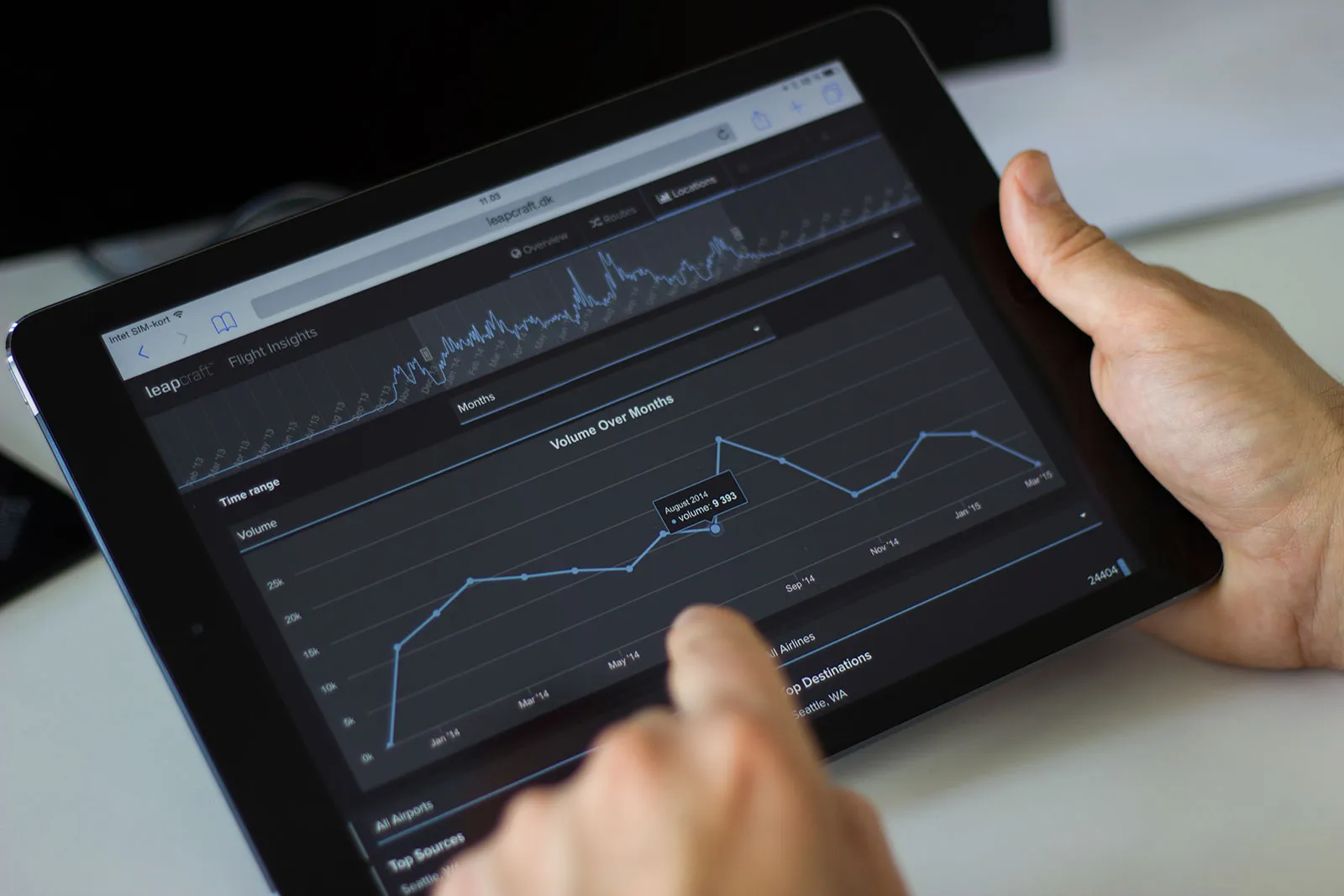
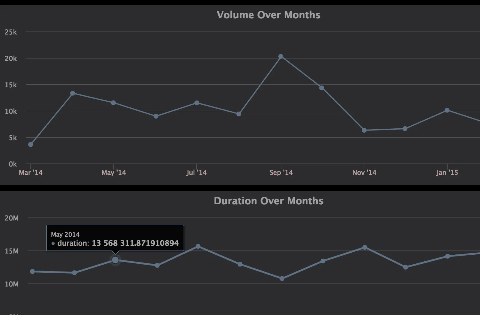
Monthly charts of booking volume and total travel time, with the exact figure on hover. The same analysis fed the service’s other reports: capacity by segment for negotiating fares, risk exposure for duty of care, fare class against travel policy, and CO2 estimated from aircraft and fuel data.
The dashboard worked down to tablet width. A brush over the daily timeline at the top sets the time range for every chart below it.