Geospatial Domain
We built the map views in DataRobot’s AutoML platform, for exploring a dataset by location and for seeing where on the map a model’s predictions go wrong. They shipped as Location AI, a public beta in DataRobot’s 6.1 release in June 2020.
Location became a variable type of its own, next to numeric, categorical and date. A column could arrive as a Shapefile, GeoJSON, Esri File Geodatabase, Well-Known Text or PostGIS geometry, or as a latitude/longitude pair that DataRobot recognised and promoted to a location. Each one gets a Geospatial Map tab alongside its histogram.
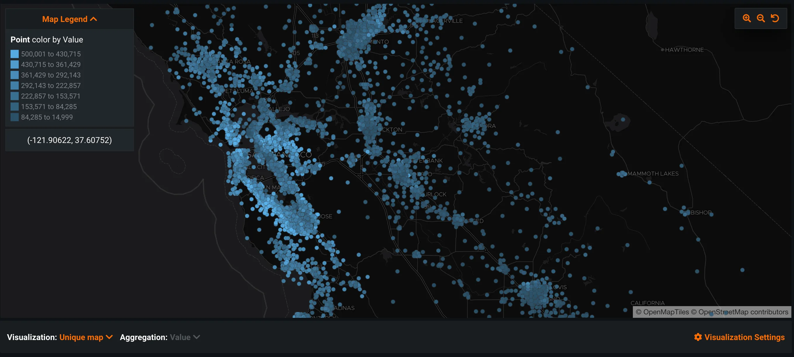
The default is a unique map: one mark per row, colored by value, with the exact coordinates on hover. Co-located rows are aggregated by min, max or average for a numeric feature, or by mode for a categorical one.
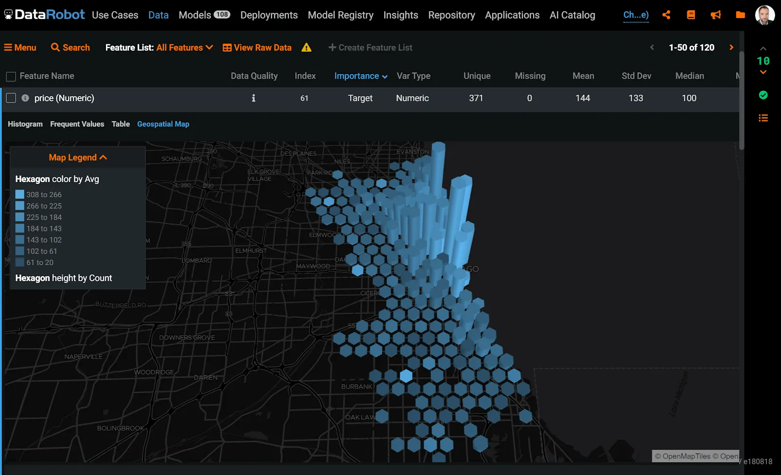
Past 20,000 unique geometries (or 50,000 vertices for lines and polygons) individual marks stop being legible, and the map switches to a kernel density view. Hexagon, grid and heat maps are also available. On the 3D maps, color and height encode two different things: the aggregated value, and how many rows fell into the bin.
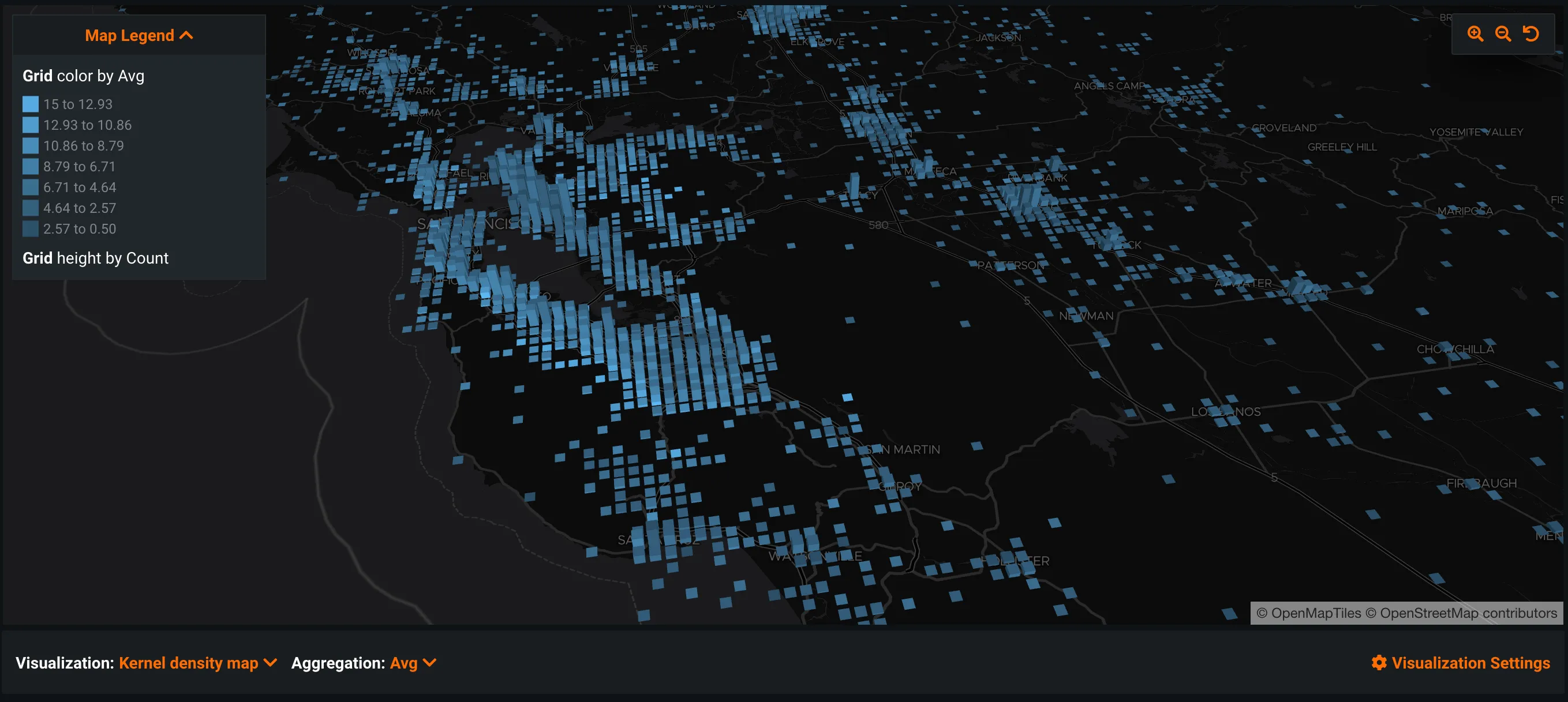
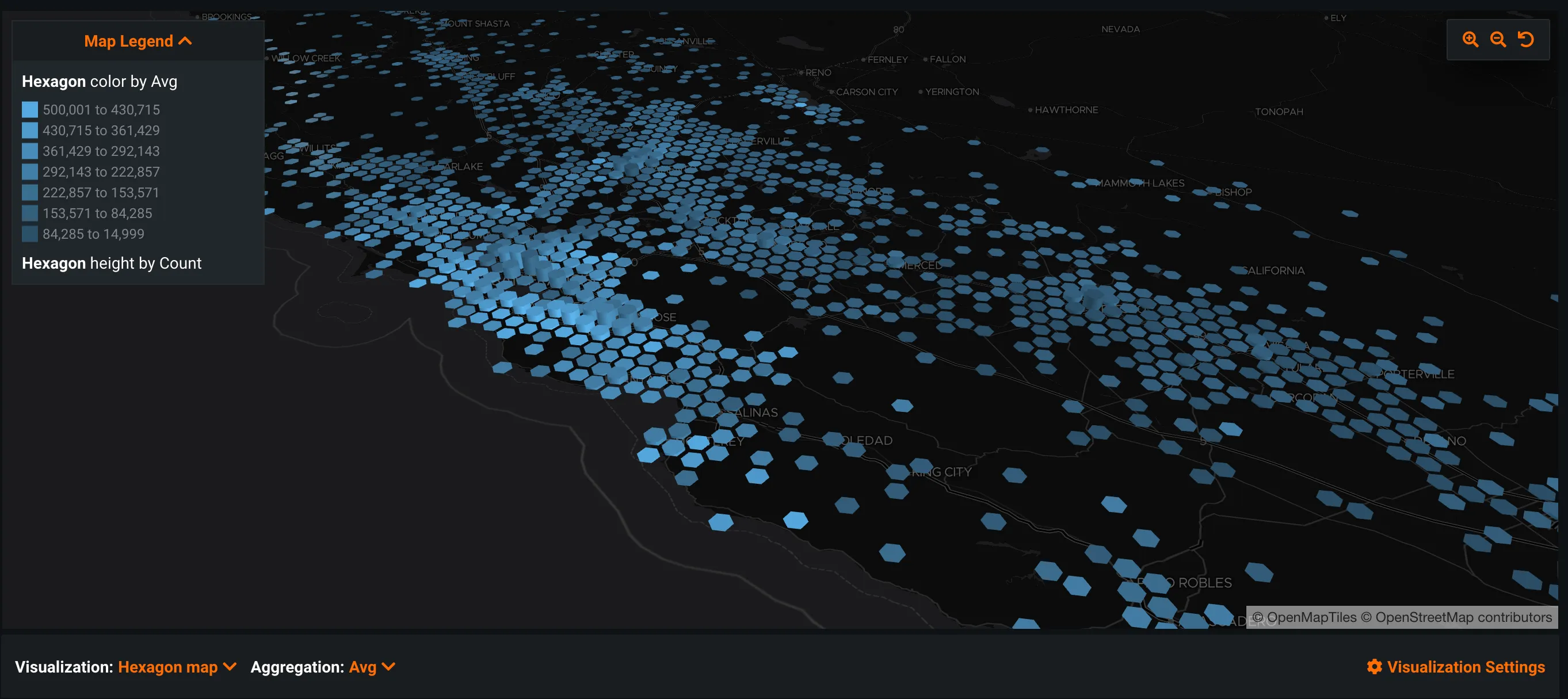
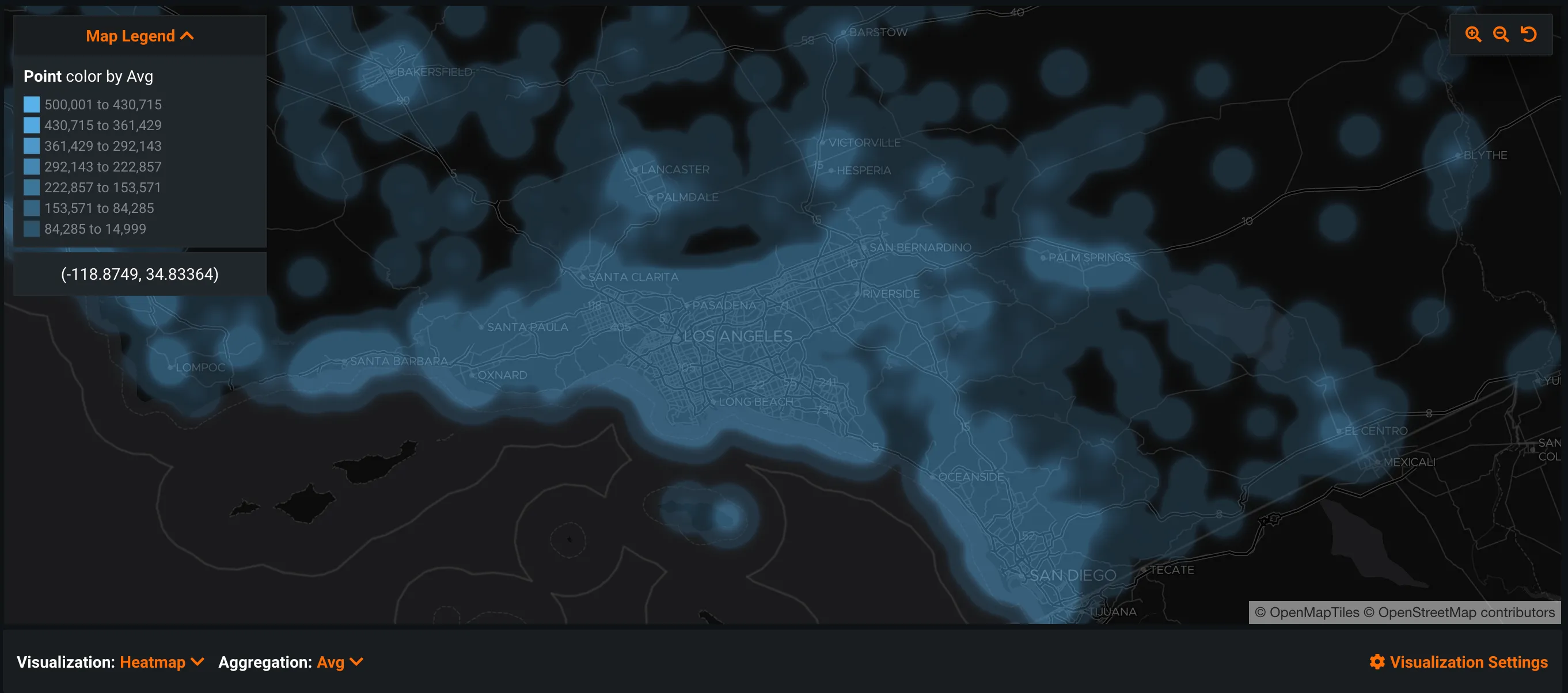
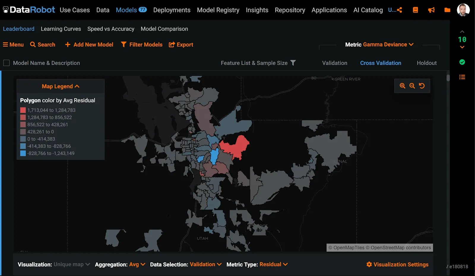
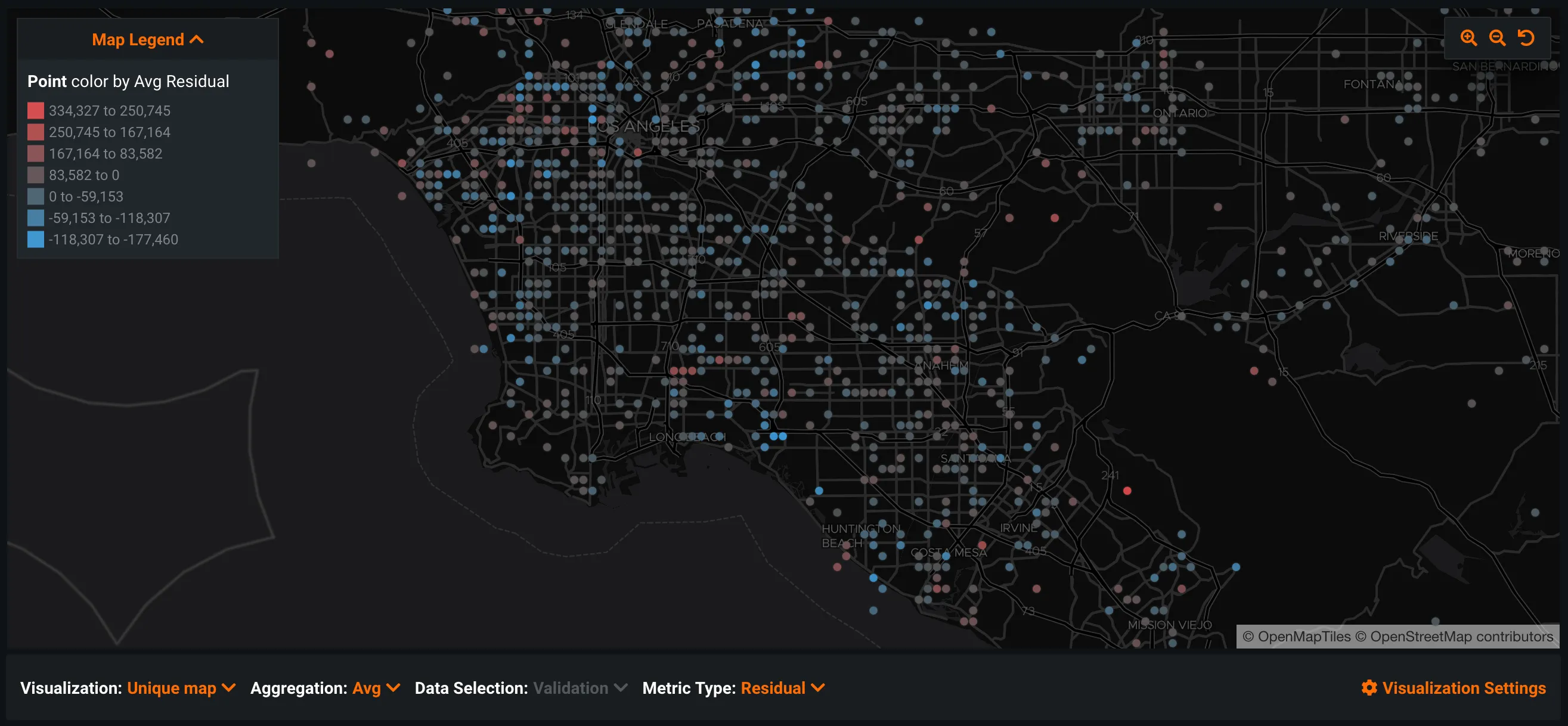
Accuracy Over Space moves the same maps from the data to a trained model. It plots residuals, actuals or predictions for the validation, cross-validation or holdout partition, so a modeller can see where a regression model is systematically wrong, not just how wrong it is on average.