
Sentinel Verify
A dashboard over a platform that watches Ethereum and its layer twos in real time, indexes what lending protocols are holding, and works out how much capital is at risk; then checks its own answer against the one the protocol publishes about itself.
Four metrics carry the top of the view: total allocation, risk capital, total capital and prime debt exposure, each with its own history. The interesting part is the line underneath: every figure names where it came from, because on this platform two sources can legitimately disagree.
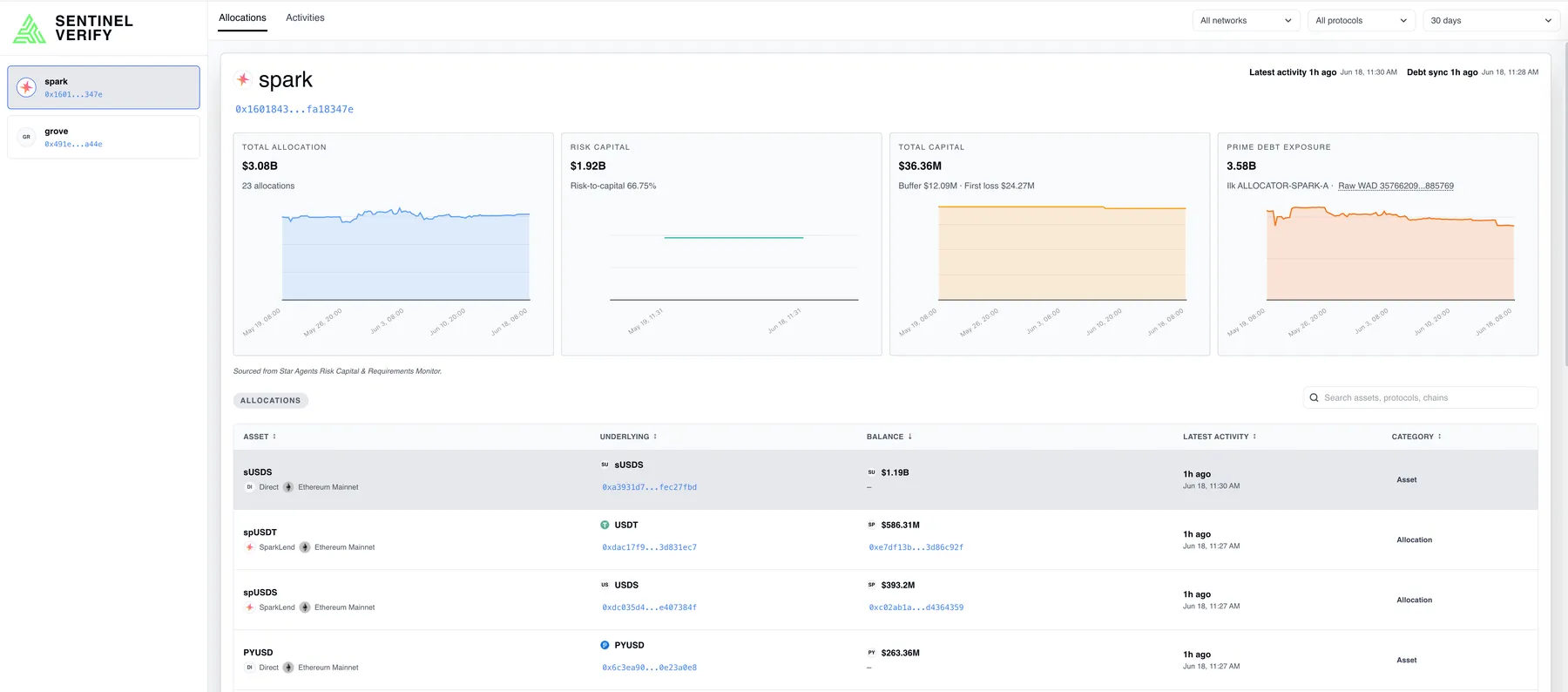
Two sources of truth, and the gap between them
The platform indexes positions directly from chain state. The protocol also publishes its own figures. These are measurements of the same thing by different routes, and where they diverge that divergence is the product, not an error to be smoothed over. An early version merged the two feeds into one column and quietly reported a 1.5× mismatch as a single number; a join defect in the same view showed $0 against a $20.3M position.
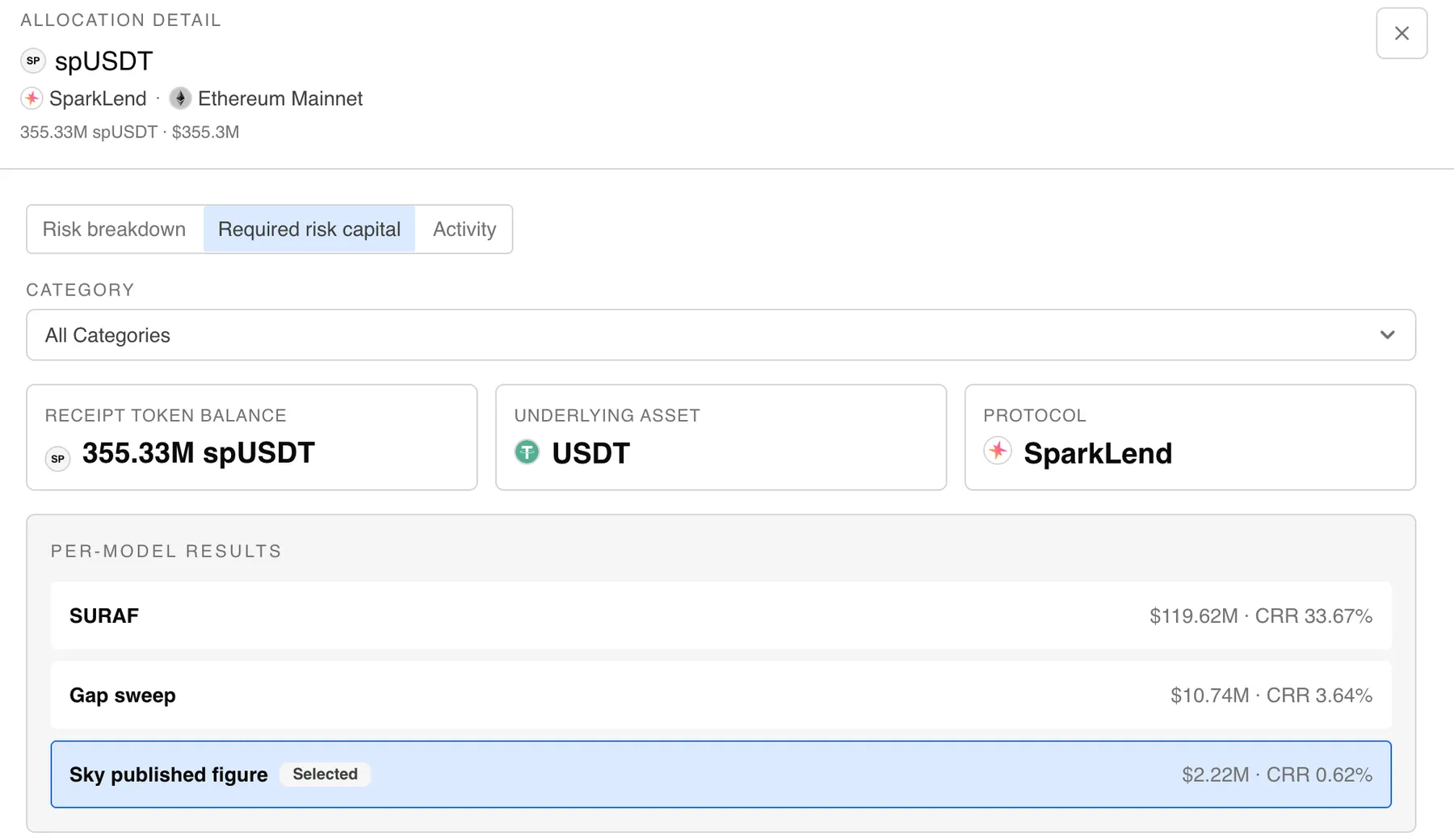
So the interface stopped averaging and started attributing. Each allocation carries its per-model results side by side (the platform’s own two models and the published figure), and the reader sees the spread rather than a reconciled fiction.
Down to the position
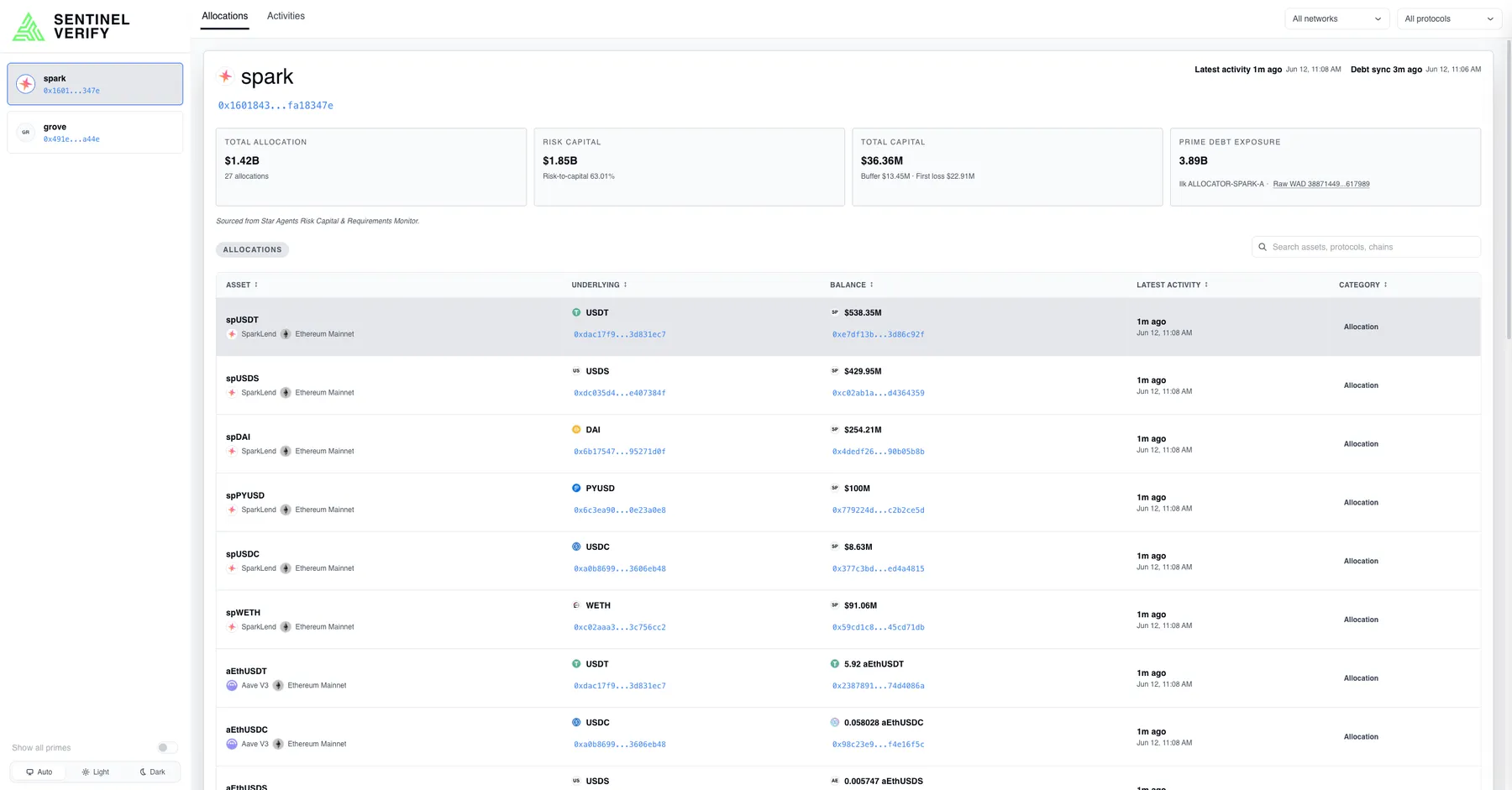
The allocations table is the working surface: every position with its underlying asset, balance, chain and category, filterable by network and protocol, with the age of the most recent on-chain activity against each row so a stale figure announces itself.
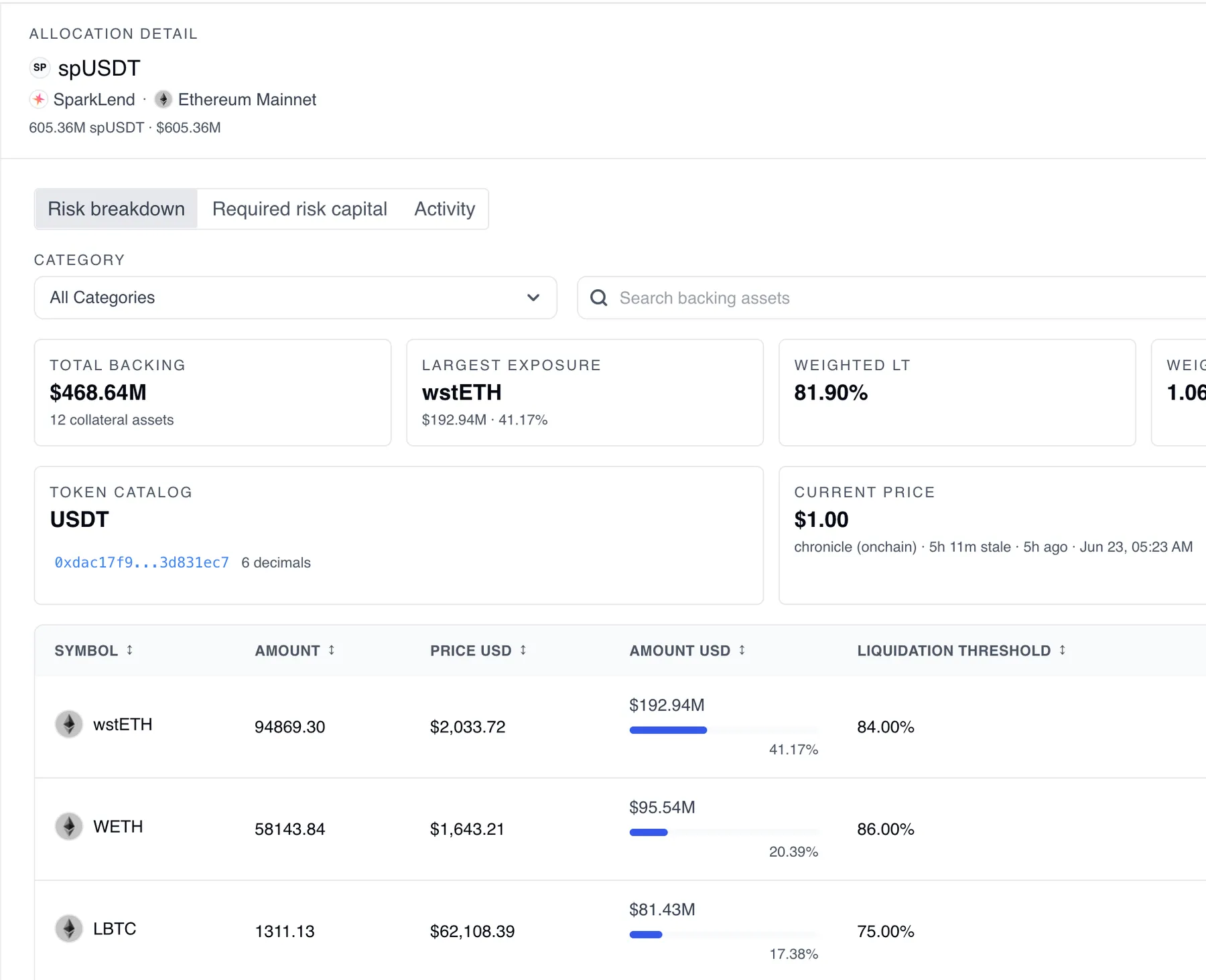
Opening a position gives the collateral behind it: every backing asset, its amount, price and share of the total, and the liquidation threshold that decides when it stops being collateral at all. Prices carry their oracle and how long ago it last spoke.
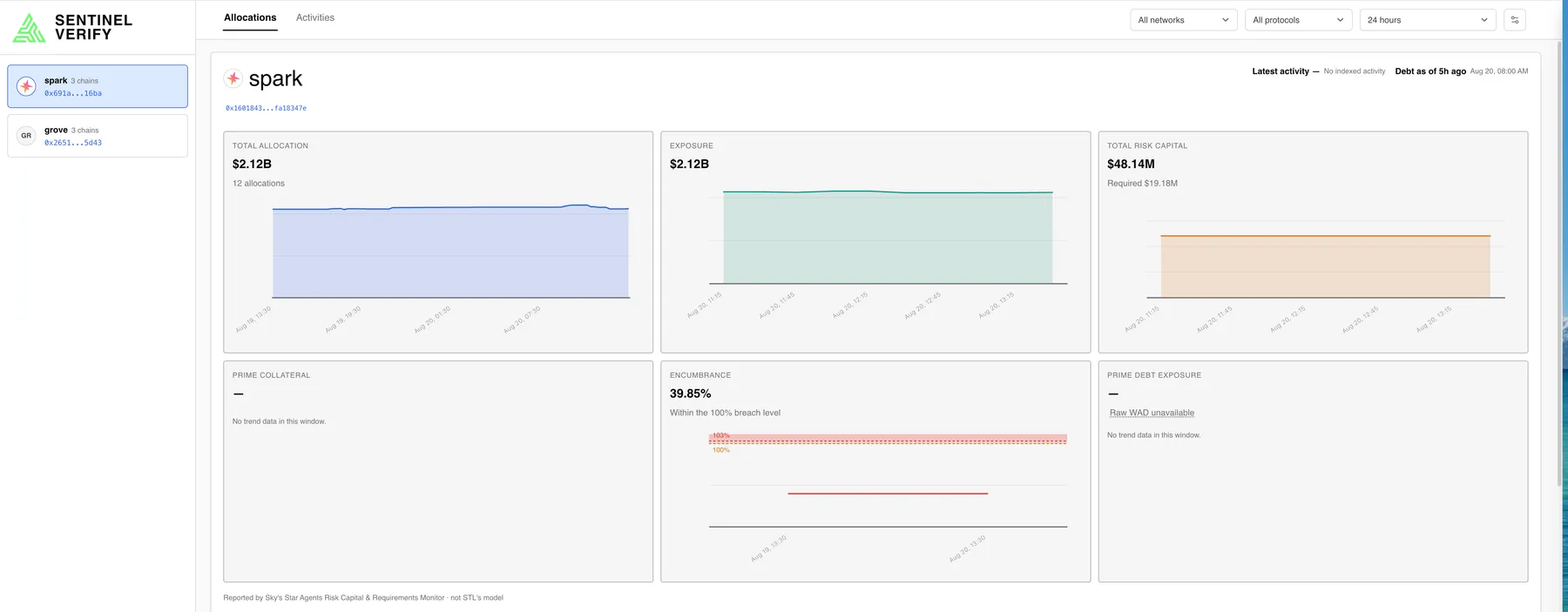
Above the positions sits the prime-level view: collateral, encumbrance against a breach level, and debt exposure, each as a trend rather than a reading, because the question is rarely what a number is and usually whether it is moving.
The system used a Go block-indexing service, a Python API for risk models, TimescaleDB and a React frontend. During incident investigation, hypertables had been recompressed without segment keys, preventing chunk pruning and forcing queries to decompress all data.