
UI Kit
A shared front-end toolkit for a company whose products all show the same kind of thing (positions, balances, risk, movement over time), and had each been building the furniture for it separately.
Seventeen packages, fifteen of them published: a design system, a charting layer, a virtualised data grid, a declarative dashboard renderer, typed HTTP client and mock packages, router utilities, and the shared build, lint and format configuration every consumer inherits rather than re-derives. Around them sits an installable contributor guide, task-specific agents and skills, generated documentation and verification tools, so engineers can build on the toolkit without relying on tribal knowledge.
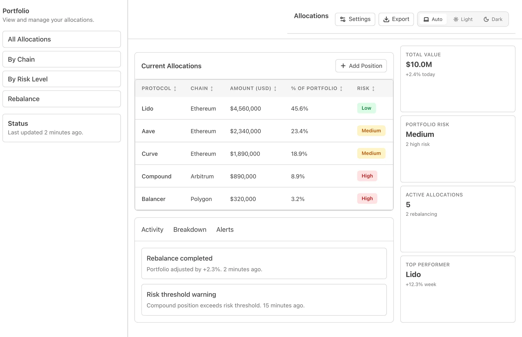
Built on primitives, not markup
The design system sits on Ark UI’s headless primitives, chosen over the alternative after a written comparison on component coverage, type safety and how much visual drift each would introduce. Headless was the point: the behaviour (focus management, keyboard handling, ARIA) comes from the primitive, and everything visible comes from a token contract the toolkit owns.
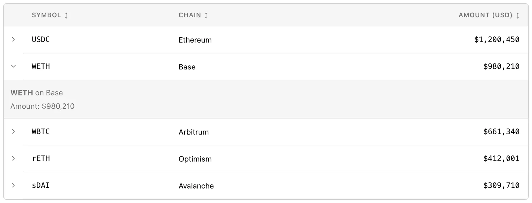
The data grid is where that pays off. Virtualised rows with a sticky header, faceted per-column filters, column resize, reorder and pinning, and master/detail expansion. Each feature composes with the others rather than living in its own reduced variant of the table.
A charting layer that knows about its neighbours
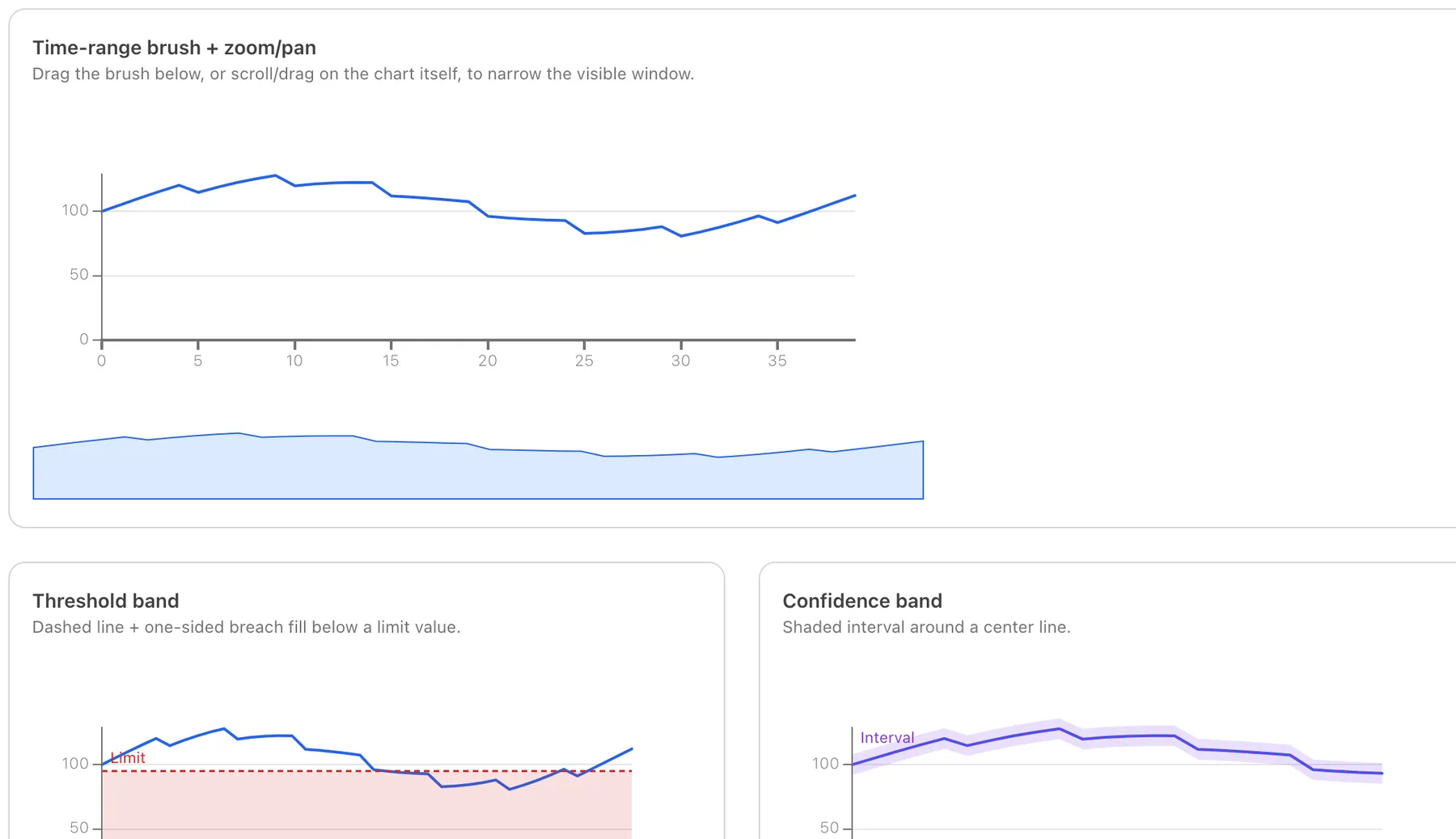
Charts wrap visx, themed from the same tokens as everything else, and add the parts a dashboard needs and a chart library usually leaves out: a time-range brush, zoom and pan, reference bands, candlesticks, and a legend. For series past a thousand points there are two downsampling strategies (largest triangle three buckets, and min/max per pixel), so the shape survives the pixel budget.
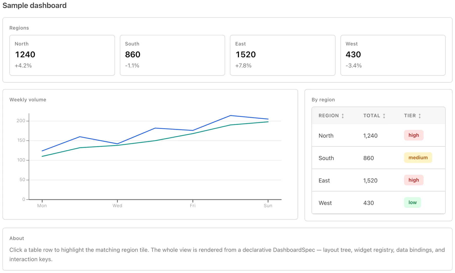
A dashboard is described rather than assembled. The renderer takes a declarative spec (a layout tree, a widget registry, data bindings) and validates it structurally and referentially without throwing, so a malformed dashboard reports what is wrong with it instead of blanking the page.
Theme and configuration checks
Dark mode is verified rather than asserted: a contrast checker in the preview measures the token pairs against AA and shows the ratio, which is how a too-subtle accent gets caught before a consumer ships it.
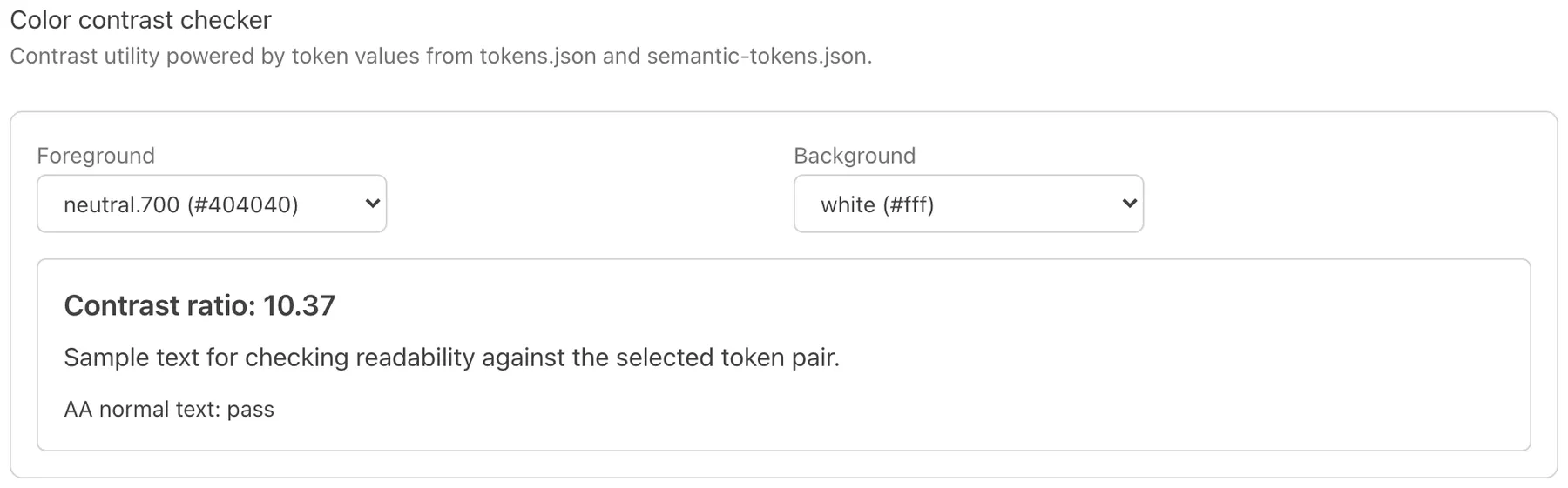
The doctor command checks consumer Panda configuration for missing recipes and undefined palette roles. An audit also found two lint rules that could not fail CI: one emitted warnings while CI ignored warnings, and one was in a category the preset did not load.
Package size
Bundle measurements also informed the package structure. Measuring each module found a charting barrel import that added 82 kB minified. One consuming application had reduced its entry chunk from 1,004 kB to 80 kB with a manually maintained chunk map; splitting the package into core, primitives and chart tiers removed the need for that map.